

I will introduce “Color Blind Pal”, a Mac app that allows you to display the names of the colors used on the website and adjust the colors to make them easier to see even for people with color blindness.
It’s easy to use and free, so it’s recommended.
This page is written for the following people.
- People who are creating or programming html or css, but are in trouble because they are colorblind and do not know the name of the color on the monitor.
- People who are having trouble distinguishing the color coding of graphs and topographic maps used on websites.
App installation, initial settings
Click the link below to install from Apple’s App Store.
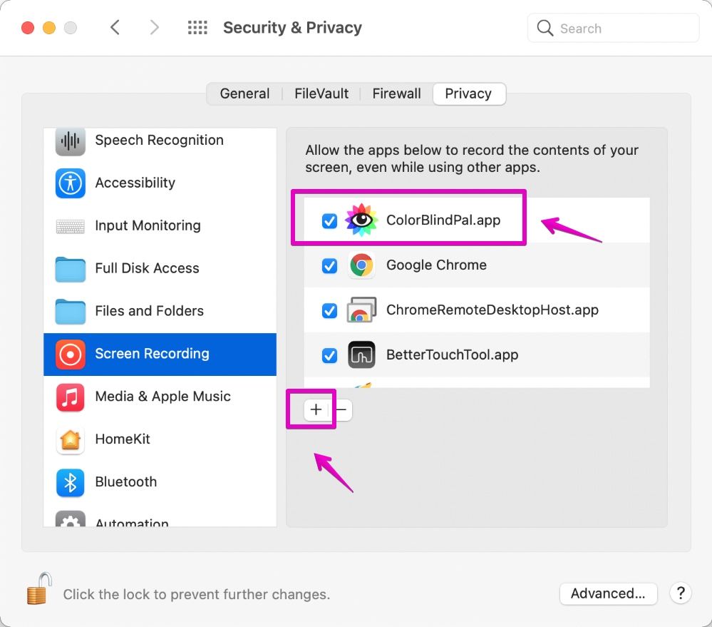
After installing the app, open “System Preferences” and allow access to “Color Blind Pal” from “Security & Privacy” and then “Screen Recording” before launching.
Also, if “ColorBlindPal” is not registered in the application list, click the “+” button to register it.
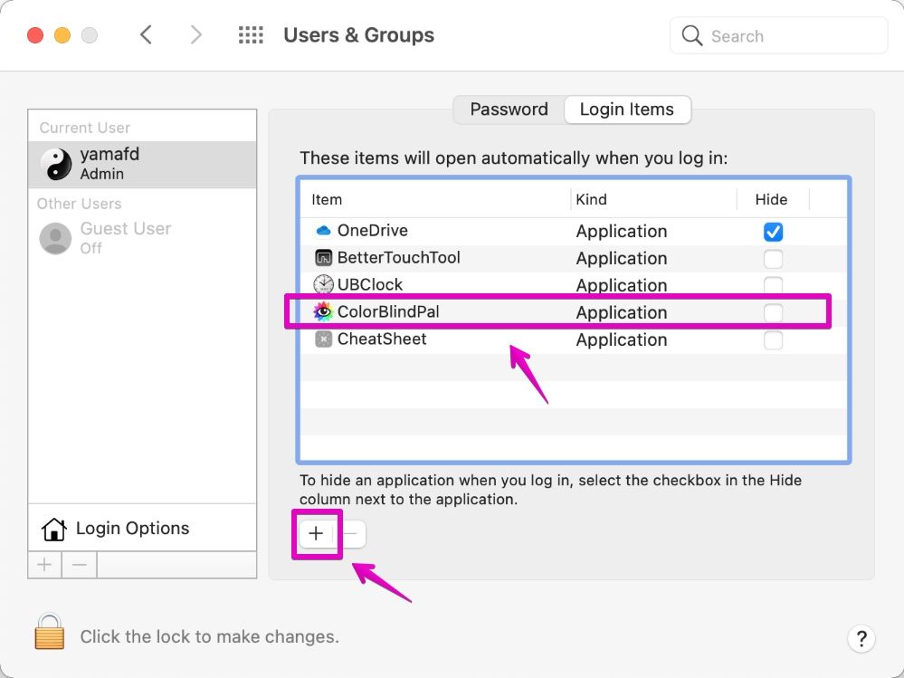
Also, register in “Login Items” from “Users and Groups” in “System Preferences” so that “Color Blind Pal” can be started automatically when you start your Mac.
This is the end of installation and initial setup.
How to find out the colors on the screen
You can display the color name even if you use it as it is, but make it possible to display the color with the RGB and HSV numerical values used in html and css.
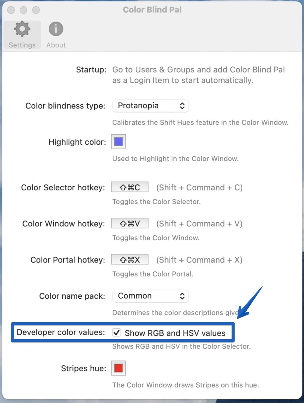
Click the “Color Blind Pal” eyeball icon displayed in the menu bar and open “Preferences …” from the displayed menu.
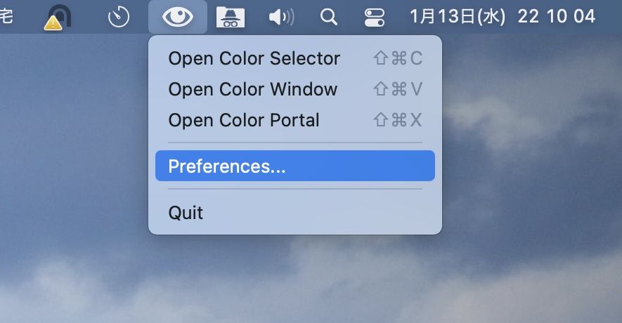
When the “Preferences” screen opens as shown below, check the “Developer color values” pointed by the arrow.
After checking, this screen will close.
Now, let’s actually check the colors on the screen.
Click the “Color Blind Pal” eyeball icon displayed on the menu bar and open “Open Color Selector” from the displayed menu.
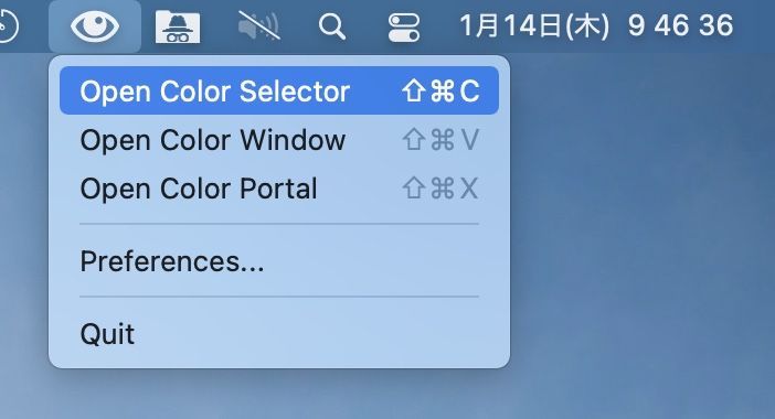
The following video is checking the colors on the screen with “Color Selector”.
When you specify the location with the mouse pointer, the color name and RGB / HSV numbers are displayed in a small window at the bottom right.
How to adjust to a color that is easy to see even if you are colorblind
There are three types of colorblindness:
If you don’t know what type you are, try changing the type settings as described below and see what they look like in the “Color Window”.
| Name | Description |
| Protanopia |
|
| Deuteranopia |
|
| Tritanopia |
|
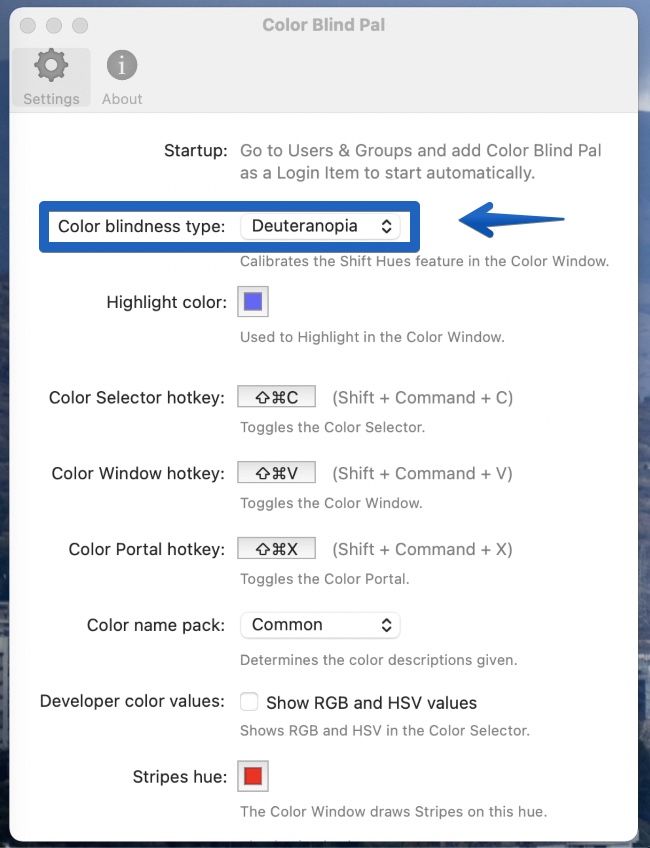
So, here’s how to change the colorblind type setting.
Click the “Color Blind Pal” eyeball icon displayed in the menu bar and open “Preferences …” from the displayed menu.
When the “Preferences” screen opens as shown below, set the “Color blindness type” indicated by the arrow.
Once set, this screen will close.
If you do not know your type, set in the order of “Deuteranopia (hard to see green)” and “Protanopia (hard to see red)”, which will be explained later.
(Check how it looks in the “Open Color Window”.)
Now, let’s use the “Color Window”, which makes it easier to see even if you are colorblind.
Click the “Color Blind Pal” eyeball icon displayed on the menu bar to open the “Open Color Window” from the displayed menu.
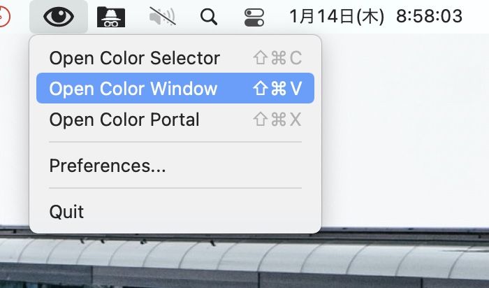
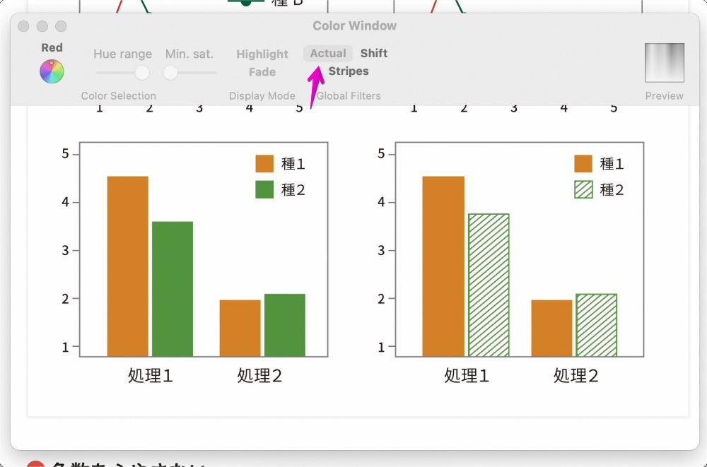
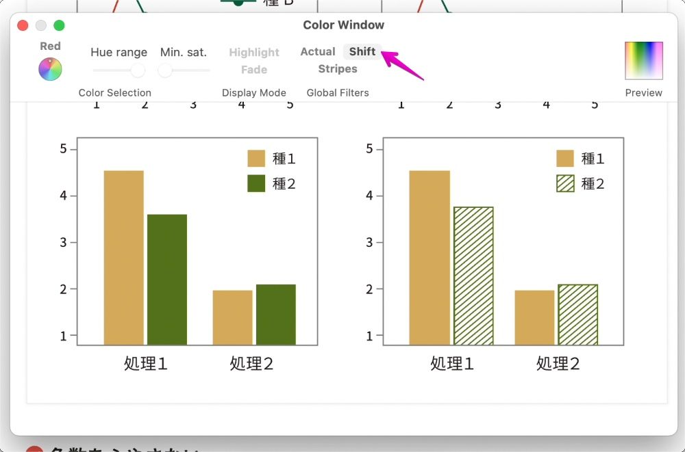
The following is the display of the “Color Window”.
There are two places that the arrow points to.
- Click “Actual” … Actual display mode
- Click “Shift” … A mode that makes it easier for people with color blindness to see
The figure below shows the actual display mode by clicking “Actual”.
On the other hand, the figure below shows a mode in which colorblind people can easily see by clicking “Shift”.
By the way, I am “Protanopia”, so it is difficult to see red, but the difference in color in the graph on the left is now clearly visible.
That’s all for the explanation.
The part of the graph in the text uses the article of the following site.

Reference information

コメント